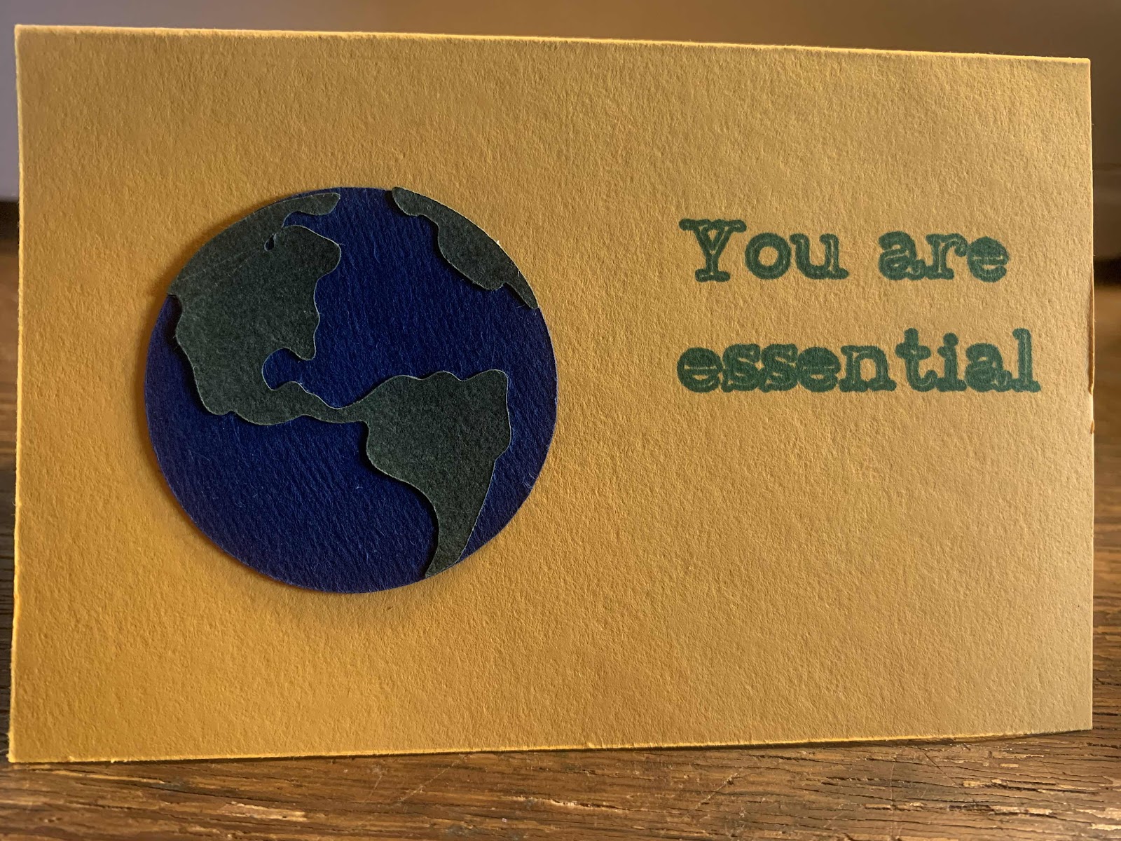
One more small step
I made another "one small step" card and I learned a few things so that it turned out a little better than last time, so I wanted to make this update post. Here is the original post which has the dimensions of each of the elements and other notes: One small step
1- I have switched to using a glue stick. The glue pens seem like they would do a better job with their little tips, but I have not quite mastered them yet and when I push the paper down it leaks out even though I thought I had only used a tiny amount. Glue sticks do not have this problem.
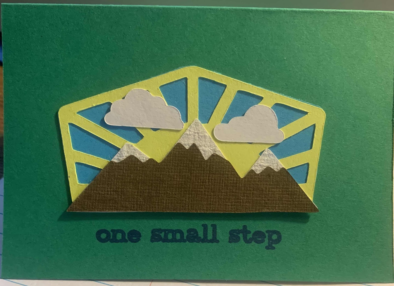
2 - I used shiny paper so that the snow sort of sparkles, though you can't tell in the pictures.
3 - I remembered to fold the inner liner before writing on it and before adding it to the card. Otherwise, if I didn't fold, the words might have landed on the crease and more importantly, if I glued it on flat and then folded the card, it caused the inside to bubble up and then there were creases.
4 - Since I have not yet figured out how to get the tiny letters transferred in a way that looks nice, I have decided (at least for now) to write the sentiment on with the Cricut.
Here is the method that I am using to do this...
I remove the blade (the whole green housing part) and I put a pen in its place.
Now, I don't own any Cricut pens and I am not sure if they were made to work with the older Cricuts, but I do have a set of sharpie ultra fine point pens.
They didn't exactly fit in place of the blade housing though, so I used a rubber pencil holder ($1 for a whole pack of them) to make up the difference.
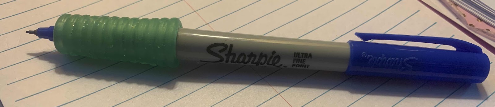

I cut a slit in my pencil holder so that it could fit other sharpies and pens as well and so that it is easier to put on the pen.
The font however is not made for a pen and it outlines the letters, but with the ultra-fine sharpie, I think it still looks good. In the newer machines, you can select some fonts that are writing fonts that are made to actually write the letters instead of outlining them for cutting.
To print the letters, I chose .25 size and used the font that came with the Cricut.
I then loaded the background cardstock on the mat and changed the position of the text so it would line up correctly.

I think this is much better than my other glue mess. :)

For this post's book recommendation, I am going to go with Symptoms of Being Human by Jeff Garvin. It is about a non-binary teen trying to fit in/blend in or at least not be noticed in high school. The book was wonderful, but I felt very called out because there were several times in the book where I was making assumptions/guesses about the birth gender of the character. The book, on purpose I am sure, does not say what the birth gender was and it truly is not important. I am ashamed that I thought of those things. It is a reminder that however open and accepting that I think I am, I still need to check myself just like I have to do with implicit bias.
Comments
Post a Comment